I designed a completely new experience for New Look’s iOS and Android e-commerce app, replacing their ageing and poorly received hybrid web app. The aim of the project was to improve app store ratings, increase monthly active users and bring conversions
and average order value to parity with mobile web.
I was the lead designer on the project, working closely with New Look’s internal product owner and UX designer. I was responsible for user research, workshop facilitation, usability
testing, low fidelity UX design and high fidelity UI design.
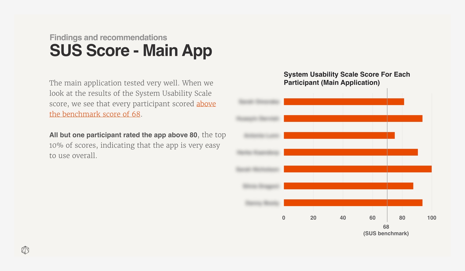
The app redesign boosted the App Store rating from 2.3 to 4.6 stars and the conversion rate and average order value went from well below, to above the mobile web benchmark.
There are two parts to this case study: the process and some of the design challenges.
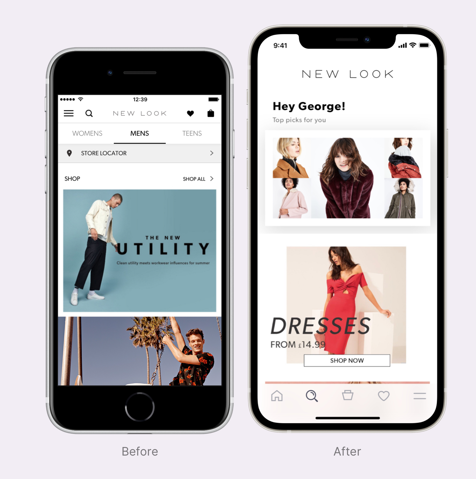
The original app was a hybrid web app delivering web content wrapped in native navigation. A litany of negative customer reviews revealed some obvious flaws around performance, stability and navigation. This led to increased customer service calls
and terrible reviews, damaging the brand.
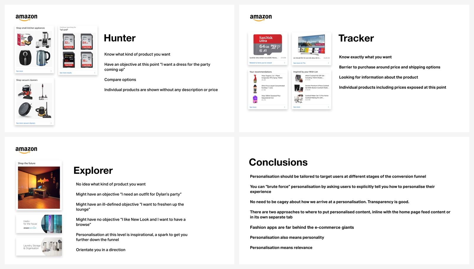
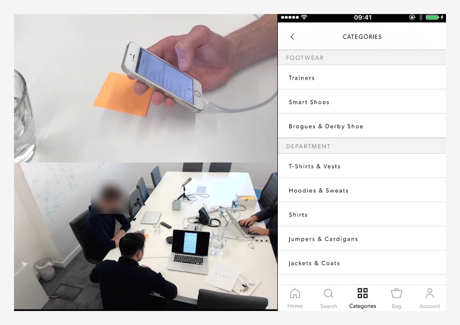
Competitor research and user interviews helped inform the core architecture of the app. It was based it around a tab bar focussing on: featured items, catalogue, bag, saved items and preferences.
As
Tigerspike had a long term engagement with New Look, I worked closely with New Look’s internal product owner and UX designer to come up with a robust design process to streamline the development of features. Below is an overview of the process
and a deep dive into the design thinking behind some of the features.
Process
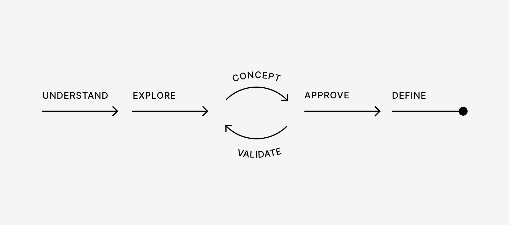
The process was based roughly on existing iterative design processes.
The 6 stages were: understand, explore, concept, validate approve and define.
In the understand stage, I work with the team to familiarise ourselves with the business need that is driving the problem we’ve been tasked to solve as well as the constraints and measures of success.
The explore stage involves understanding user behaviour, the competitive landscape and technical capabilities and constraints. This was usually through desk research or interviews with customers. I created surveys with the team to elicit feedback from users.
The concept stage involves creating artefacts based on learnings from the understand stage that might provide a solution to the original problem statement. This could be a high fidelity interactive prototype or something as simple as a napkin sketch.
In the validate stage we test the concept to see how well it addresses the original problem statement. Depending on what we learn in this stage, we might iterate the concept based on our learnings.
In the approve stage the team presents back to the product team a validated concept that meets user and business needs.
Once the concept has been signed off, assets can be created to assist development.
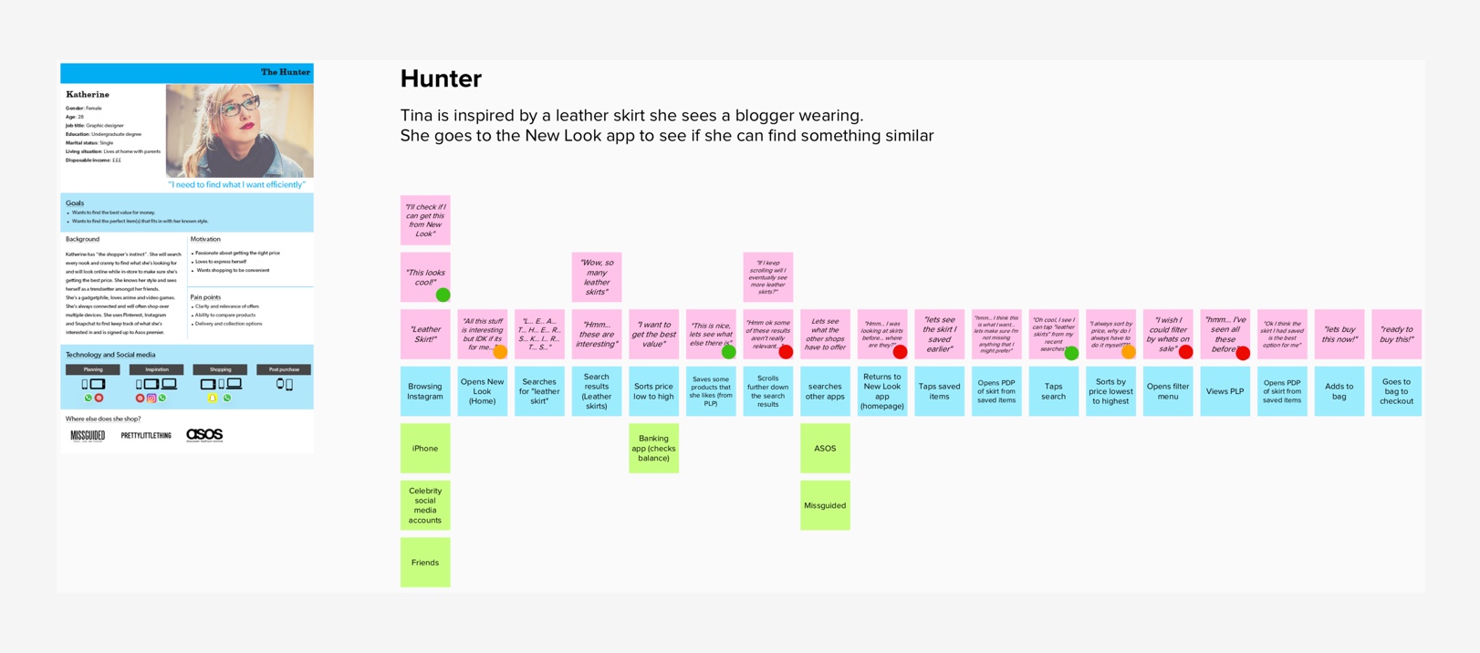
Saved Items
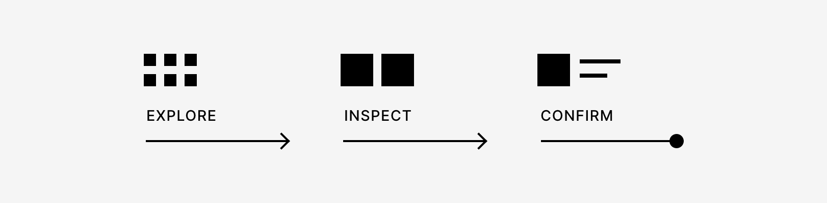
New Look has a huge product catalogue. Users want to get through as many products as possible for fear of missing out. They typically save items they like as they go. In this exploratory part of their journey, users aren’t so worried about inspecting product details. We help users see a lot of products at once by letting them view products in a clean, 3 column grid, without the distraction of product details.
When users review their saved items, they have moved from an exploratory mode into an inspecting mode. Here they’re concerned with the texture of the product, how it looks from different angles and details like price.
We help users by zooming
in on the product and allowing them to scroll through alternate product images without having to jump in and out of product detail pages.
We also show the price and size picker, but we tuck it out of the way as they explore the alternate product images so it doesn’t obscure the images.
Bag
When a user is reviewing their bag, they’re operating in a fact checking mode, so the key information we show them are product details like size and price.
We also up-sell some of the user’s saved items. This helps them meet the free
shipping threshold.
I was lucky to be able to design delightful micro-interactions that elevate the experience.
Since the redesigned app launched, the iOS App Store rating rose from 2.4 to 4.7 stars.